UX in direct communication channels: 6 crucial things to consider
 Łukasz Jackiewicz
 © Monster Ztudio via Canva Pro
Usually, when we’re discussing direct communication, we tend to focus on its effectiveness and maybe common dos and don’ts. However, the UX component is also incredibly important – with all the user experience boxes checked, your messages can be more effective and attractive to current and potential users and clients. How so?
Although the majority of people associate user experience (UX) with web and mobile apps and websites, the truth is that it’s a very broad term encompassing all the experiences your clients/customers/users have when interacting with your brand. This fact refers to direct communication as well, with web and mobile push included.
So, if your company utilizes direct communication channels such as emails, text messages, and push notifications, what should you pay attention to regarding UX?
Understand how people interact with your messages
While there are some common points when it comes to all those channels, there are some differences between the way people interact with your emails, text messages, and push notifications. They also have different purposes.
Some time ago, Toku.com published a study showing preferred communication channels depending on the nature of your message. Here are the results:

Source: https://toku.co/blog/communication-apis-sdks-seamless-ecommerce-experiences/
For example, text messages (SMS) work best when it comes to reminders and updates. However, when your brand is releasing a new product or running a campaign, email is the preferred channel for the majority of respondents. WhatsApp is the third most popular communication channel, and people also are willing to use it for reminders and order delivery updates.
Although push notifications are not on this list, it is important to understand how they should be used. For starters, you need to understand that those notifications have an interruptive nature. Your users/customers are doing something on their devices, and suddenly – a message pops up. For many of your customers, the first instinct is to close the notification, even without reading it thoroughly.
The only way of dealing with this challenge is by making them super relevant and attractive to your customers. Web and mobile push notifications should never be about your brand. They always need to be about your customers – what they can get and what matters to them. And it’s a good general rule to keep in mind throughout the entire communication and marketing of your brand. If you want to be relevant to your customers – talk about them and their needs.
Here’s a good example of a customer-oriented push notification:

It’s all about the customer. There is no excessive messaging, this notification is short and to the point – you still need to finish your order, perhaps now is a good time to do so. That’s all you need to succeed with this form of communication.
UX foundation: Clarity and conciseness
We live in dynamic times, no one has the time to read lengthy emails and text messages. Whenever you want to send some sort of a direct message to your recipients, make sure you are clear about the purpose of your message and that you are concise.
Imagine such a scenario: You use clickbait in your email and keep the essence of it to the very end of the message. To make things worse, the essence was disappointing – your customer was expecting a great deal, but they only got a 5% discount. How will this message affect your brand’s UX? No doubt, it will have a detrimental effect, as your recipients will simply be irritated with your message.
Good UX is also about respecting your audience. That’s why you should never mislead them or waste their time.
Personalization is essential to UX
No matter what communication channel you use, personalization is extremely important. According to a study published in 2023, personalization is what can help you win a customer – over 55% of respondents need a personalized experience to become a regular customer (increase from 2022):

Source: https://segment.com/state-of-personalization-report/
Personalization starts with access to a sufficient amount of information about your customers. You need to have their credentials (this is where personalization starts) but also track their activity and interactions with your brand. This way you can send them messages that are tailored specifically to a given person.
One way to achieve that is by using variables in your messages. Naturally, your communication system needs access to those variables, so you need to collect them, but once that’s done, you can send personalized messages. Take a look at how it works with the PushPushGo platform for web and mobile push notifications:

With access to variables, you can refer to your customer’s name, last visit, cart content, etc. making the whole message far more effective compared to generic messages sent to everyone.
Visual design
UX has a lot to do with visual experiences. While each communication system has some constraints when it comes to available visual solutions, you should make the most of them and tailor them to your brand identity. This way, you can build consistent brand experience, which is also important from the trust standpoint.
When it comes to visual communication, email is where you can do most. There are thousands of beautiful HTML templates allowing you to make your newsletters and promotional emails look visually attractive. However, we advise you not to overdo it. A bright and colorful email can be difficult to read and even tiring. Rather, stick to your brand’s image and make sure that your email is, above all, legible.
Your emails should not be too cluttered and full of many different visual elements. In UX, less is more most of the time.
Keep this one rule in mind: Design strengthens copy, not the other way around. Design is to make UX better, but the content of your message is what triggers action.
And what about push notifications? Because of their form, you have a limited number of options. In fact, it’s your operational system and internet browser that define how they look. However, you can still improve their design to work well with your brand within the limits imposed by third-party tools.
In most cases, you can add:
A thumbnail image
Your company’s logo
A CTA button (it’s a very important element!)
Emojis (use them sparingly, though)
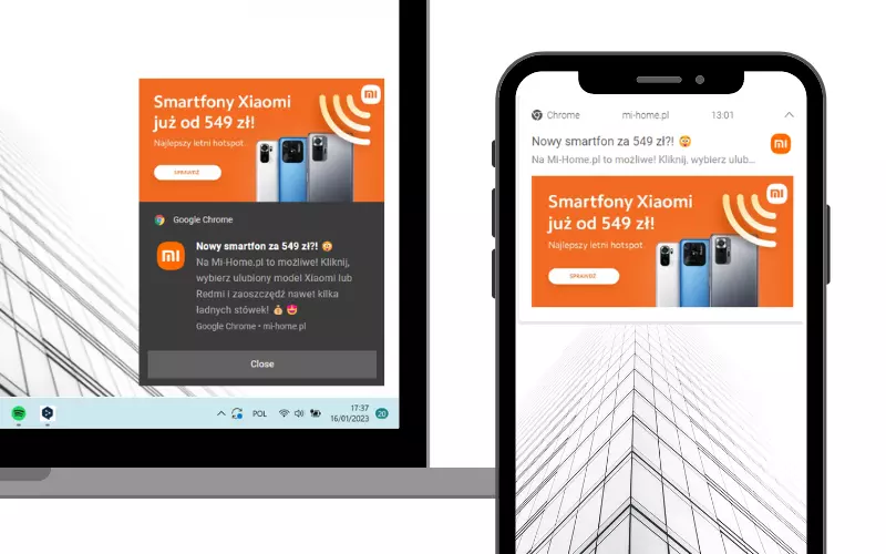
Take a look at this example of a push notification sent by Mi-Home:

The company added their own graphic and logo, making this small piece of their marketing fully compliant with their positioning and brand image. And that’s what you should strive for as well.
A/B testing
You should never be too definitive when it comes to UX. In fact, it's your users who decide whether their UX is good or not. That said, you should be open to the signals coming from the market. One way you can do so is by continually testing your direct messages, both when it comes to copy and design.
Run A/B tests to see what resonates with your target audience best. This way, you’ll be able to find this sweet spot where all (or at least the majority) of the elements work and look exactly the way your target audience expects.
Accessibility
Accessibility and inclusive design can also influence the UX. Make sure all the graphic and textual elements in your direct communication are legible and easy to click on different devices. Spaces between different clickable elements are also immensely important. This way, you minimize the risk of accidentally clicking the wrong button. When in doubt, it’s best to follow the WCAG guidelines for accessible design.
For example, take a look at how UX agency Visux ensures there are adequate spaces between different clickable elements:

This way all users can easily locate the intended element and click it without any problems. Plus, as we mentioned before, white space between buttons and other elements makes your design more legible and lighter.
Naturally, you ought to ensure your mobile design is also tailored to different users; spaces and button sizes on small screens should generally be slightly bigger compared to desktop screens.
Summary
When designing direct communication with your customers/users, think not just about its effectiveness but also the UX. There are six major things to consider:
The way people interact with a specific communication channel
Clarity
Personalization
Appropriate visual design
A/B tests
Accessibility
Keep them in mind when communicating with your audience, and you will improve their experiences when interacting with your brand. And that’s what will allow you to get ahead and build a loyal audience.
If you need help with UX design for your communication or a digital product, you can consult a trusted UX agency to make sure you don’t lose any UX opportunities.

Co-founder and Head of Design @ Visux
Łukasz has over 17 years of experience as a designer. In his work, Łukasz focuses on designing highly-converting and aesthetic digital products. Currently he oversees all the design projects at Visux. In the past, he worked for such brands as Samsung, Microsoft, Vichy, Durex, and Amway.
Try PushPushGo to engage and connect with your audience.
Create an account and start testing!


-hzt7f7q26h.webp)
