How to optimize image in web push notification and increase CTR?
 Klaudia Kania
Did you know that:
Facebook posts with images generate 2.3X times more engagement than posts without,
Tweets with images have 150% more retweets than tweets without,
Publishers that use visual content grow traffic 12x faster in comparison with those that don’t (source: Digital Information World)?
Moreover, by analyzing data of PushPushGo clients, we noticed that for example in the travel sectorweb push campaigns that included images have an average CTR of 5,03% in contrast with 4,70% of campaigns without one and in the finance sector average CTR of mass campaigns with picture was 5,17% in the contrast to 4,56% without.
Of course, it is important to add that not every browser supports images in web push notifications. At the moment, only Google Chrome and Microsoft Edge allow sending so-called Rich Push or simply speaking web push notifications that include big images.
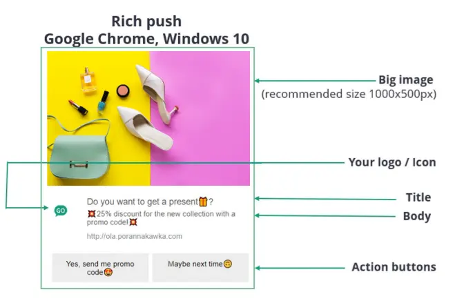
Even though only two browsers support this feature, the potential audience reach is quite high. According to NetMarketShare in May 2021, the usage share of the Google Chrome browser was 65,23% and of Edge - 5,1%. This means that over 70% of Internet users would be able to receive push notifications with additional graphics.
Why are visuals effective?
Here are a few interesting psychological facts about the perception of visuals by users and why adding image to your campaign can have a positive impact on results:
Our brain needs only 13 milliseconds to process an image (source: Massachusetts Institute of Technology). This can be especially helpful in times of short attention span.
We remember only about 10% of the information we hear, 20% - we read and 80% we see (source: MovableInk).
It is much easier for most people to process images rather than text: 60% of the population are visual learners (source: Venngage).
So, does it mean all images are evenly effective? Unfortunately, the answer is no.
Top 3 mistakes when using images in web push notifications
Wrong proportions, as a result, the product you would like to present might be cut.
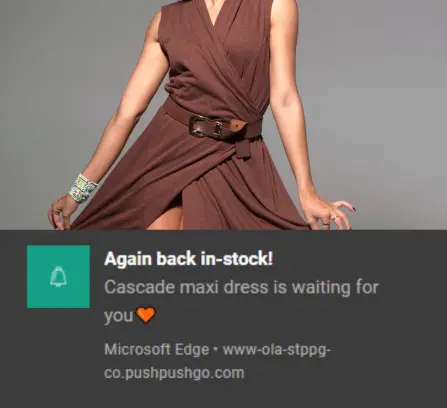
Poor image quality and low resolution.
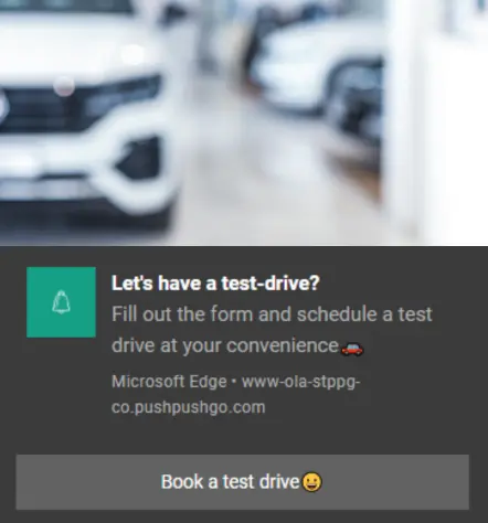
Low contrast between the main subject on the picture and the background colour.
As well as we dedicate time to design a great newsletter or advertisement banner it is important to take care of graphics for web push notifications. 93% of online users stated that image quality is one of the main factors in their buying decision (Justuno).
Fortunately, there is no need to be a professional graphic designer. Today there are a lot of free or paid tools such as Canva or Visme available for everyone. With little effort, you can prepare high-quality pictures for your web push campaigns.
So, how to prepare a perfect image for a web push campaign?
Technical recommendations to follow
Make sure that your banners have the right shape (web push notifications are compatible with rectangular images, we recommend 1000 x 500 px or aspect ratio 2:1) and they do not exceed 200 KB.
Images are added on the top of the push notification, and their orientation is horizontal. Make sure that your product/ design/ logo is perfectly aligned and it matches the content smoothly.
The previous two steps are especially important for e-commerce sites that have enabled automation scenarios integrated with their Product Feeds from which PushPushGo application takes pictures of the product range, for example in cross-selling or last seen offer scenarios. With wrong proportions, images will be cropped in an uncontrolled way.
Use high-quality images with eye-catching, bright or contrasting colours. They should, of course, correspond with your brand/site to increase brand awareness throughout your audience.
Keep an eye on current graphic design trends, colour studies and test different variations of those. Every audience is different and only you know what works best for your subscribers.
Design tips: web push notifications image that users will click
Be consistent with your brand - follow your brand voice and style guide.
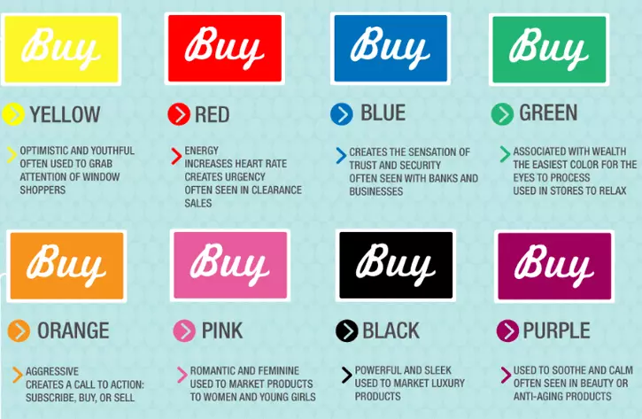
Colours matter, while some colours can trigger impulsive purchases (for example, red), others can encourage well-thought-out purchase choices (for example, green). Moreover, according to Inc.com, 75% of snap decisions are based on colour.
Source: Adstarget
If you would like to add text to your web push picture make sure it is easy to read. Make your headline and body copy different sizes. However, try to keep text to a minimum on your web push graphics.
Use pictures that will show the usage of your products in daily life. According to Big Commerce, 78% of users prefer lifestyle product images. Do not sell just a sofa, sell the cosy atmosphere of home👩❤️👨.
Feature real people in your photos. 62,3% of users would like to see the products used by other people according to Toluna research. It is much easier for potential customers to imagine themselves using the product.
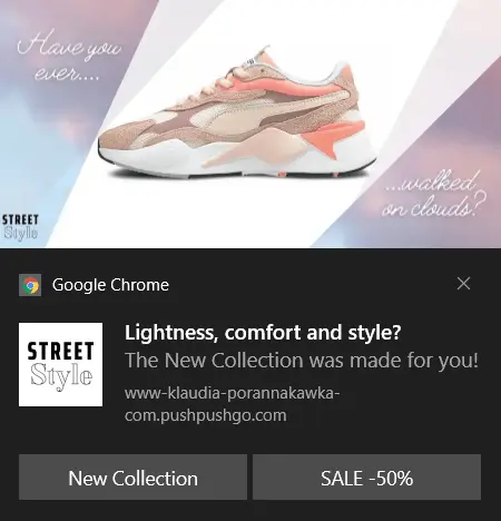
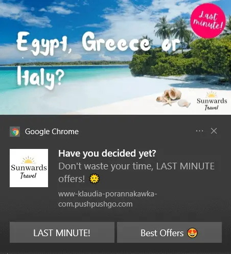
Have a look at these examples to get inspired:
In conclusion...
Attractive pictures in web push notifications can affect users behaviour, increase Click Through Rate and impact purchasing decisions. Follow our recommendations and remember that your subscribers deserve only high-quality content including visuals❤️

Account Manager @PushPushGo
She looks after PushPushGo customers, solving their pain points and advising them on how to get the best results from our solutions. Passionate about graphic design, visuals and their role in communicating effectively with the user.
Try PushPushGo to engage and connect with your audience.
Create an account and start testing!
-ncqm7pkw70.webp)


