



Do you like to prepare reports? Not many people do. On the one hand, all marketers know that analytics allows us to make better marketing decisions, but on the other, it is often much more time consuming than we would like. The necessity of creating reports, extracting data from many different sources can take up so much time, that there is none left for the analysis of that data itself. But no matter if you are one of those who loves to prepare reports, or if you do so only because you must, you will find Google Data Studio very helpful. If you want more information, check out our free webinar.
There are many tools for creating dashboards with marketing data, but they can be quite complicated or crazy expensive. Data Studio is on the user-friendly side, while also being free of charge - all you need to start using it is a Google account.
You can easily connect it with multiple data sources, including most of the Google products - such as Google Analytics, Google Ads, Search Console, Google Sheets, and many others. With a few clicks, you can have visualized data from all of these places in one, interactive dashboard.
And if that’s not enough for you, there are also many partner integrations, which allow you to connect sources like Facebook or Linkedin Ads, your Mailchimp account, and other major sources of marketing data.
So, how to start working on a dashboard in Data Studio? Log into your Google Account that has access to the data sources you would like to see on your dashboard and go to https://datastudio.google.com/. You can also start by choosing “New” directly in your Google drive and choosing “Google Data Studio”.
The, decide if you want to start working on a blank canvas, or use one of the templates provided by Google - all you have to do there is link your own data source. For the purpose of this tutorial, we will go with the blank.
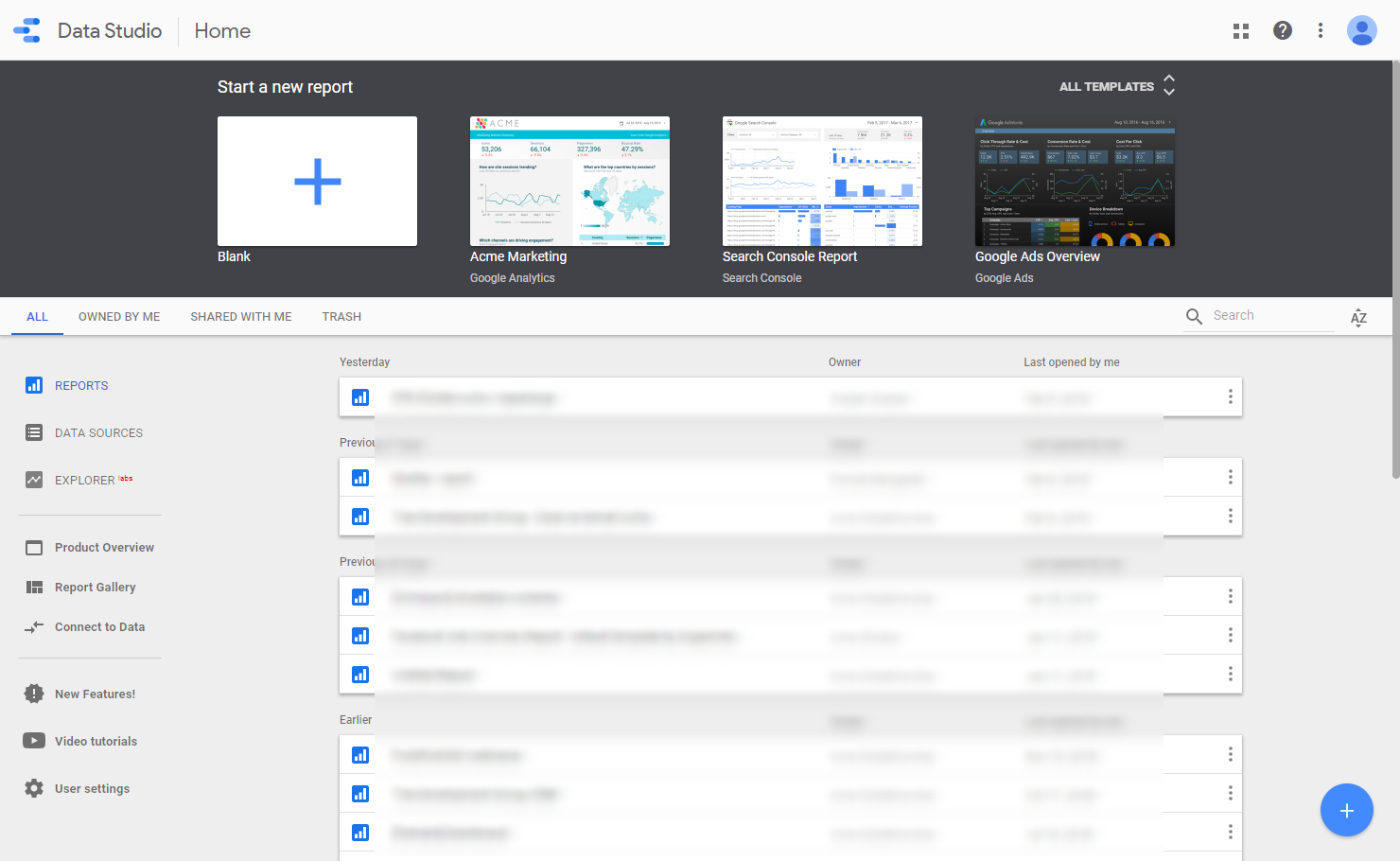
Before you start creating charts and tables on your dashboard, you need to add at least one source of data. Data Studio will present you with sources you have already connected, as well as sample data that I will use in this tutorial.
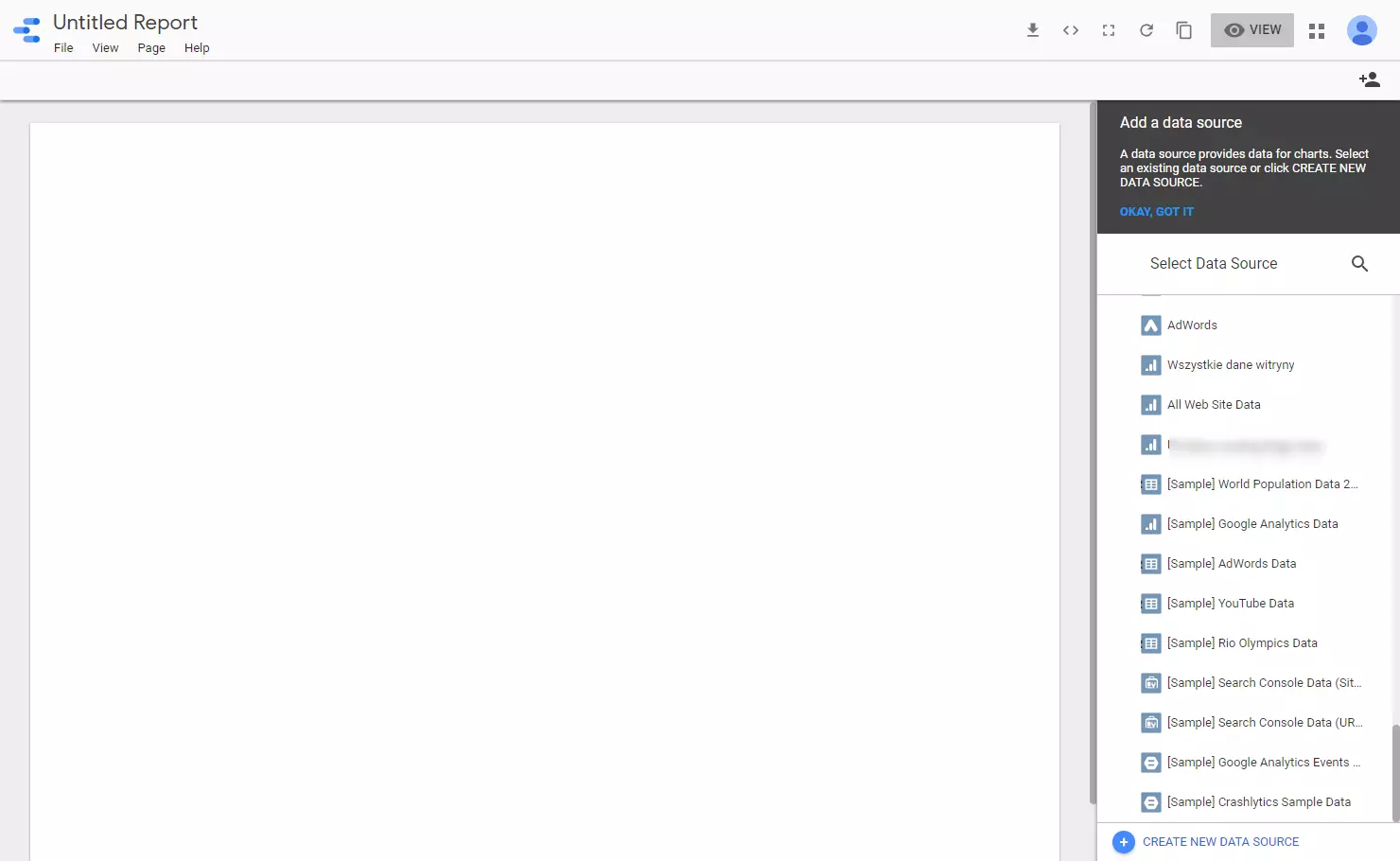
If that’s your first time in Data Studio choose “Create new data source” and decide which app you would like to connect first. If that is Google Analytics or Google Ads you will be asked to choose which account would you like to use (and in case of GA also which view).
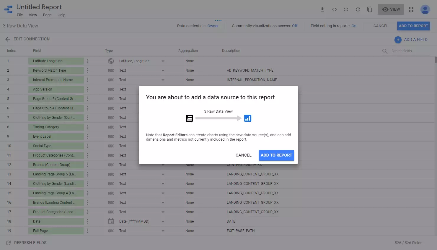
Then you will be transferred to a view that might look quite scary, but if you are using one of the products mentioned above, you most likely don’t have to take a second look at it - all data should be correctly mapped into the appropriate format. If you chose source such as Google Sheets, where you are responsible for naming columns and completing them with data, you might want to take a look if everything looks okay - for example if columns with dates have been recognized as such and if monetary values have the right currency assigned.
After that’s all sorted out click “Add to report”. You’ll see a request for confirmation - just click “Add to report” again.
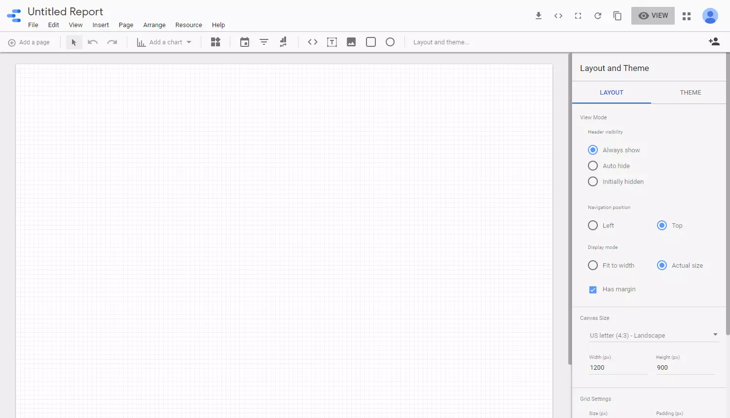
Now when your data source is connected you will get access to the Data Studio interface in all its glory.
I think that the easiest way to get familiar with a new tool and gain confidence in using is to click-through the available options and features, and I strongly encourage you to do so. Explore available chart options, check out how you can adjust the layout and your theme.
And when you feel satisfied, or have no idea what to do, come back to this article or register for a webinar, where you will be able to get more information.
Now, let’s go straight to the fun part!
Click “Add a chart” and decide which option will best portray the data you want to visualize. I would like to see the traffic on my website and how it changes in time, as well as compare it to the previous period, so for the start I will go with the “Time series”.
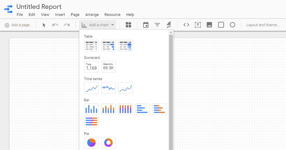
A box with a chart will appear on your dashboard - you can easily move it in the drag&drop style, as well as resize it by dragging on its corners. The panel on the right side of the screen will allow you to adjust the data you see.
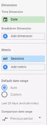
In this case, our dimension (what you see on the X-axis, or in the first column of a table) is date, but for other types of charts it could be for example “Source / medium” or “Acquisition channel”.
Then it’s time to choose the second part of the chart - our metric. In case of GA it might be sessions, new users, goal completions - whatever you want to see. It is important to note, that you might add more than one (and in the style tab define which one should appear on which axis ). You can also add a comparison to data from a previous period, which is what I did here.
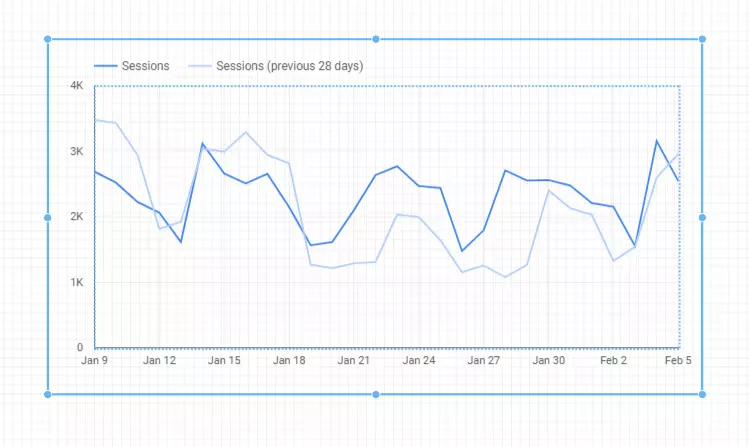
Now, when my (and hopefully yours too!) chart is ready, let’s get to work on how to make it interactive.
This is what makes data studio special. In just a few clicks you can add time & other filter controls, to make your dashboard come to life. This feature really comes in handy when you want to be able to for example view the same data for different traffic sources, while not having to create multiple charts.
First, let’s add the date range control. Click the calendar icon on the top bar. The date control will appear on your dashboard. In the tab on the right side of the screen, you will be able to define which date range should be default to your report - for example last 30 days.
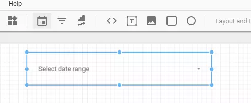
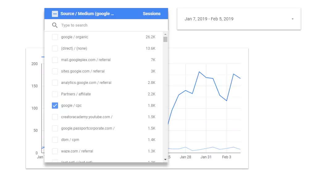
Then, click the “filter control” icon next to it and in the tab on the right side of the screen choose which dimension it should use. Let’s say that you are presenting your report to the board of directors, and they want to know how particular marketing channels performed in terms of traffic. You don’t have to prepare a chart for each - just choose a filter control with dimension such as “Source/ Medium”.
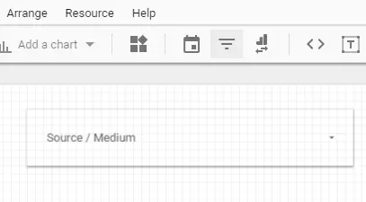
To see how what you just did performs in real life click the “View” button in the top right corner of the screen and play with these controls - you will be able to see how your chosen metric performed in the chosen period of time, depending on different marketing channels - such as Google Organic or Google CPC.
Now you have all the basic knowledge to be able to create your own dashboard with your most important marketing data - such as performance of your website, goal completions, performance of your Google Ads campaign, or your web push campaigns (as long as you’re using UTMs). I encourage you to play around with styling & elements such as text and shapes to create labels for your charts, in order to create compelling story with your visualised data.
If you would like to learn more about Google Data Studio features, sharing reports with co-workers and clients, connecting data from sources like Facebook Ads, or see examples of real marketing dashboards in action, then I would like to invite you to my webinar on 20th of February 2019 4 PM CEST - Marketing analytics for everyone? Meet Google Data Studio!. If you have any questions after reading this article, you will have an opportunity to ask them during the webinar. See you there!
In Skalski Growth she provides full customer service in the field of growth marketing. She specializes in marketing activities addressed to business clients. She has worked with companies such as Omnipack, Printbox and Tree Development Group. She is passionate about marketing analytics and finding new ways to generate leads.
.png)
.png)
-3pf2xltbnb.webp)