Push subscription forms - which one works best?
 Aleksandra Kozioł
A subscription form is the first point of contact between you and your subscriber. And in PushPushGo, there are many ways to approach that first contact.
Push notifications, both web and mobile, are subscription-based. This means that potential push subscribers must first opt-in to receive notifications.
The opt-in model can seem to be reductive. But in reality, it allows you to communicate with users that are most interested in your messages. And, further down the line, most likely to make a purchase.
What's also important, is that, unlike emails and newsletters, push notification subscription doesn't require users to leave any personal data, like name and email address. Subscribing to push notifications only takes one click. Or two. Or sliding a toggle switch. Jump right into the fascinating world of web push subscription form.
Web push subscription forms
One-step push subscription form
One-step web push subscription form, or browser subscription form, is the easiest, most straightforward way to invite your visitors to sign in. The subscription form is non-customizable. The exact shape, size, and position are defined by the browser the visitor is using.

Despite its simplicity, the one-step push subscription form is also among the most effective. No additional clicks are necessary, so the visitors are more likely to just press the button and subscribe.
Two-step web push subscription form
If you think your visitors may require an additional incentive, use the two-step push subscription form. In this option, an additional, fully customizable form will appear. Only after the user clicks to opt in in the subscription pop-up, a browser form will appear.
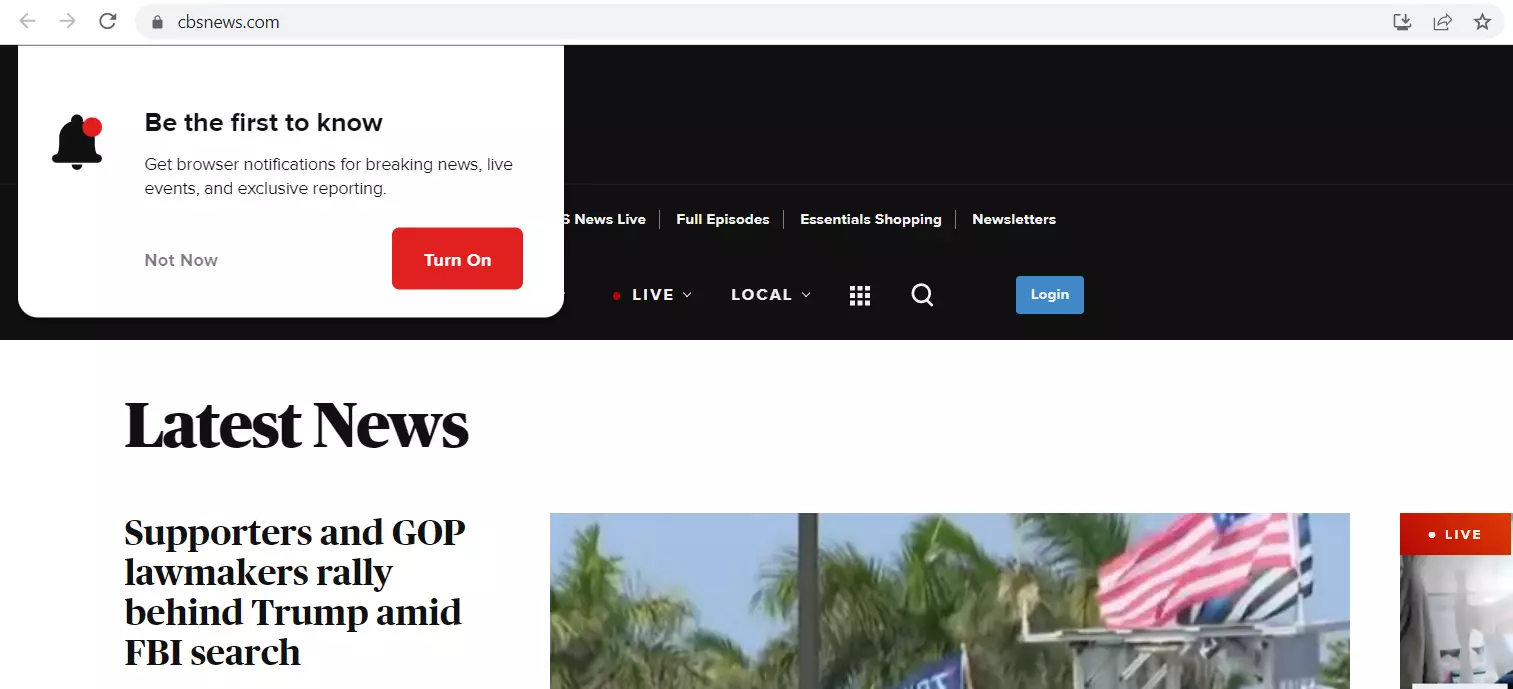
This gives you a chance to address your users more directly, with a call to action that may resonate with them. Make sure you phrase it in a way that appeals to them and is consistent with your company's tone of voice.
Form customization options
As we've mentioned before, the browser subscription form's shape and size are set up by the browser itself. However, you can still tweak it a little to serve you better. The following settings are available both for one-step and two-step subscription forms.
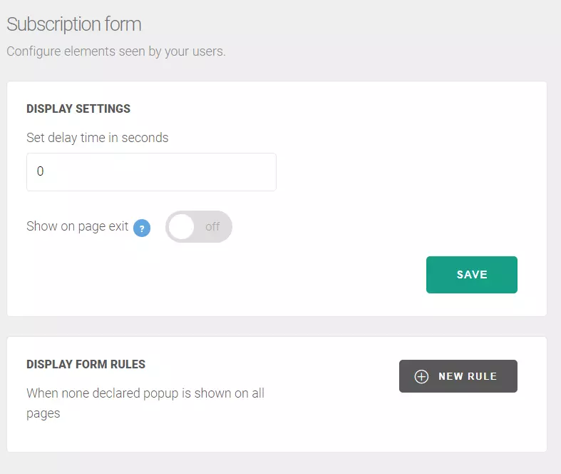
Choose pages for displaying the push opt-in form
Not every page on your website requires the subscription form to pop up. You can choose a range of the pages where the form appears and over time experiment with this setting to choose the best spot
Set up a delay for your subscription form
You may want to delay the appearance of the subscription form. This way your client has more time to browse and familiarize themselves with your offer before opting in to your push notifications.
Additional push subscription methods
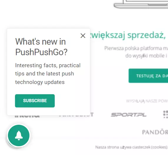
The opt-in forms can be dismissed by the user, sometimes even without giving the push opt-in any thought. That's why it's better to keep a backup. With PushPushGo subscription widgets, you can keep the subscription invitation open.
Bell widget for the push subscription
The bell widget is an additional element that can remind your visitors about push subscriptions. It is displayed in the form of a bell on the address bar in the browser. After the user clicks on the widget, a browser form will appear, so that they can confirm their subscription to push notifications.
Toggle switch
Unlike the bell widget, the toggle switch can be placed at any place on your website. It's non-invasive and easy to use. Put them anywhere on the pages of your website and give your visitors a chance to explore before subscribing to push notifications on their own time.

After a user decides to opt for it using the toggle switch, the browser subscription form appears. Then, they can confirm their decision and become your subscribers.
You can read more about the toggle switch and push subscription here.
How to employ push subscription forms
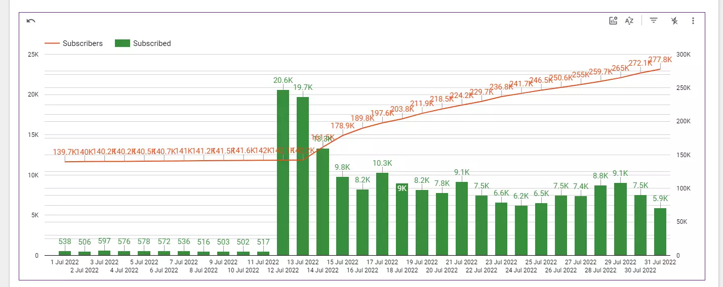
The results of our clients' strategies show us that simplicity works best. Just see the chart showing the rapid growth in subscription numbers after one of our clients switched from a two-step to a one-step subscription form:
Push subscriptions with PushPushGo
If you want to learn more about our services and talk about strategies that will work best for you, contact us at hello@pushpushgo.com


Content Specialist @PushPushGo
Editor and writer. She is interested in media and new technologies.
Try PushPushGo to engage and connect with your audience.
Create an account and start testing!
